Table of contents
What is color accessibility?
Colour accessibility refers to the design of digital content taking into account the needs of users with colour vision impairments, such as colour blindness. The aim is to select colour combinations in such a way that information is communicated clearly and distinctly - regardless of how people perceive colours.
Meaning of colour accessibility
Colour design plays a central role in the visual perception of content. For people with colour vision deficiencies (about 8% of men and 0.5% of women worldwide), an inappropriate choice of colour can lead to misunderstandings or barriers to access. Colour accessibility helps to remove such barriers and promotes an inclusive user experience.
Why is this important?
Inclusion: People with colour vision deficiencies can use content just as effectively.
Improved usability: Designs with clear contrasts and alternative display formats are easier to understand for all users.
Legal requirements: Many countries require accessible digital content, e.g. through the WCAG (Web Content Accessibility Guidelines).
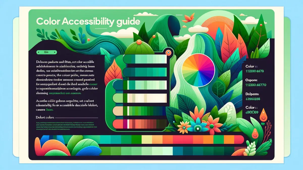
Key aspects of colour accessibility
1. colour contrasts
Make sure that texts and important graphic elements have sufficient contrast to their backgrounds.
WCAG recommends a minimum contrast ratio of 4.5:1 for normal text and 3:1 for large text (from 18px or bold from 14px).
2. do not rely on colour alone
Information should not be conveyed by colour alone. Example:
Instead of using only red and green markers, combine them with symbols or text (e.g. tick for "success" and a cross for "error").
3. colour palette tests
Check the accessibility of your colour palettes with tools such as:
Colour Contrast Checker (WebAIM)
Sim Daltonism (simulation of colour blindness)
Accessible Colors (test combinations).
4. complementary colours
Use colours from opposite areas of the colour wheel for strong contrasts.
5. differences in brightness
Combine light and dark colours to improve legibility - especially for text on coloured backgrounds.
Best Practices für Color Accessibility
1. planning and design
Choose an accessible colour palette as early as the design phase.
Avoid purely decorative colour schemes that do not support functionality.
2. use alternative representations
Supplement colour-coded information with symbols, patterns or text.
Example: Instead of only displaying red warning messages, add a warning symbol or explanatory text.
3. testing with real users
Test your designs with people who have colour vision impairments to ensure they are accessible.
4. flexibility through customised settings
Allow users to customise their own colour schemes or contrast settings.
Implement an "accessibility mode" that enables high contrast or greyscale.
5. avoid colour traps
Avoid difficult combinations such as red-green or blue-yellow, as these are often difficult to distinguish.
Vorteile von Color Accessibility
1. improved user experience
Colour-accessible designs improve the experience for all users - not just those with colour vision deficiencies.
2. increased reach
Accessible colour design expands your target audience and ensures that no one is excluded.
3. legal compliance
Compliance with WCAG guidelines is required by law in many countries (e.g. EU Digital Accessibility Directive). Companies risk legal consequences if they fail to comply.
Conclusion
Colour accessibility is an essential component of inclusive web design and should not be neglected when designing digital products. By considering colour contrasts, alternative display formats and the use of suitable tools, developers and designers can break down barriers and create a better user experience.
With the growing focus on accessibility - particularly through the Accessibility Enhancement Act from June 2025 - colour accessibility will not only be an ethical obligation, but also a legal necessity. Invest in accessible design to increase your reach, satisfy your users and future-proof your digital presence!
Frequently asked questions (FAQ)
How do I know if my website is colour accessible?
You can check your website with specialised tools such as the WebAIM Color Contrast Checker, which checks whether your colour combinations meet the WCAG criteria for contrast.
Can colour changes influence the brand image?
While colour changes can influence the visual appearance of a brand, the use of accessible colour schemes allows the brand to be perceived by a wider audience. Strategic adaptations can strengthen the brand image by showing a commitment to inclusion.

Reach our specialists for accessible web design
We are here to help you. Together we can master your digital challenges and promote inclusion on the Internet. Let us make your projects successful with accessible web design.