Colour contrast calculator: easily check WCAG-compliant colours
A colour contrast calculator is a digital tool that helps you to ensure the legibility of text and graphic elements on websites, in apps or other digital products. It calculates the contrast ratio between two colours - typically a foreground colour (e.g. text colour) and a background colour - and checks whether this ratio meets the requirements of the Web Content Accessibility Guidelines (WCAG).
Why is sufficient colour contrast so important?
You may be wondering why so much importance is attached to colour contrast. Sufficient contrast between foreground and background colours is fundamental to making digital content accessible to all user groups. People with various types of visual impairments, such as colour blindness, generally low vision or age-related visual impairments, benefit enormously from well-contrasting colours. For them, too little contrast can mean that texts are difficult or impossible to read and important information is lost.
However, the benefits of good colour contrast are not limited to people with visual impairments. Every user benefits because a clear distinction between text and background improves general legibility and reduces eye strain. Just think of situations where you are trying to read content on your smartphone in bright sunlight or need to quickly grasp information on a small screen. In all these moments, a strong contrast makes all the difference for a positive user experience (UX). In addition, compliance with accessibility standards, as required in Germany by the Barrier-free Information Technology Ordinance (BITV) based on the WCAG, is not just a recommendation in many areas, but a legal obligation.
How does a colour contrast calculator work in detail?
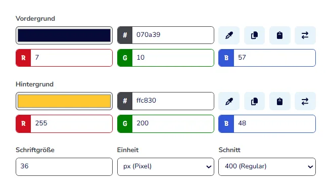
Fortunately, most colour contrast calculators are very straightforward and user-friendly. As a rule, you enter the colour codes of the foreground and background colour to be checked in the fields provided. Hexadecimal codes are the most common (e.g. #333333 for a dark grey or #FFFFFF for white), but many tools also accept RGB (red, green, blue) or HSL (hue, saturation, lightness) values.
Once you have entered the colours, the tool calculates the exact contrast ratio in the background. This calculation is based on the relative luminance values of the two colours, a measure of how bright a colour appears to the human eye. The result of this calculation is a number, for example 7.5:1. The calculator then shows you whether this ratio fulfils the minimum requirements of the WCAG for different conformance levels (usually AA and AAA) and for different text sizes (normal text vs. large text). Many modern contrast calculators also offer a direct visual preview of the selected colour combination so that you can get an immediate impression of the effect.
A practical example: The contrast calculator from barrierefreies.design
To make the application clearer to you, we would like to introduce you to a recommended and easily accessible tool: the contrast calculator for colours from barrierefreies.design. This online tool is characterised by its intuitive operation and clear presentation of results. You can define your foreground and background colours using hex, RGB or HSL values. The tool immediately provides you with the exact contrast ratio and an easy-to-understand evaluation in accordance with the WCAG 2.1 criteria for levels AA and AAA, for both normal and large font sizes. The additional visual preview helps you to assess the colour effect directly. This calculator is an excellent example of how you can easily check and optimise the accessibility of your colour decisions.
How to successfully integrate the contrast test into your daily work routine
Using a colour contrast calculator should not be a one-off act, but an integral part of your design and development process. Start checking the colour contrasts as early as possible, ideally during the first design drafts, to avoid costly corrections later on. Don't just think about the body text of your website or app, but also consider all interactive and informative elements. This includes buttons, links, icons, form fields and their labelling as well as graphic elements that convey important information.
Many modern web browsers now have integrated developer tools that also offer contrast checking functions and are a good addition to specialised calculators. And perhaps the most important piece of advice: never rely solely on your subjective perception. A colour combination that appears clear and distinct to you personally may be illegible to another person with a visual impairment. The objective figures and assessments of a contrast calculator are your most reliable guide here.
By using colour contrast calculators regularly and consciously, you are making an important contribution to digital inclusion. It's a seemingly small tool, but it has a hugely positive impact on the accessibility and user-friendliness of your digital products for all people.

Reach our specialists for accessible web design
We are here to help you. Together we can master your digital challenges and promote inclusion on the Internet. Let us make your projects successful with accessible web design.
Frequently asked questions (FAQ) about the colour contrast calculator
What exactly is a colour contrast calculator?
A colour contrast calculator is a digital tool that calculates the contrast ratio between two colours (usually foreground and background) and checks whether this ratio complies with the accessibility guidelines (WCAG) to ensure good readability.
Why should I use a colour contrast calculator?
You should use a colour contrast calculator to ensure that your digital content (websites, apps, etc.) is easy to read for people with visual impairments and to improve the overall user experience for everyone. It also helps to fulfil legal accessibility requirements.
Which WCAG contrast values are important?
The WCAG defines minimum contrast ratios. For normal text, a ratio of 4.5:1 (level AA) or 7:1 (level AAA) is usually aimed for. For large text (from 18 point or 14 point bold) the requirements are somewhat lower: 3:1 (level AA) or 4.5:1 (level AAA).
How do I enter colours into a contrast calculator?
Most contrast calculators accept hexadecimal colour codes (e.g. #FF0000), RGB values (e.g. rgb(255, 0, 0)) or HSL values.
Is there a difference between contrast for text and for graphics?
Yes, WCAG 2.1 has also introduced criteria for the contrast of graphic elements and controls (often referred to as "non-text contrast"), which should be at least 3:1.
Can I rely on my own eyesight to judge contrasts?
No, this is not recommended. Your subjective perception may differ greatly from that of other people, especially those with visual impairments. Always use a calculator for objective measurements.
Where can I find good colour contrast calculators online?
There are many good free tools. One example is the contrast calculator from barrierefreies.design. Many design programmes (such as Figma, Adobe XD) and browser developer tools also offer integrated contrast checkers.
Do I have to carry out a test for each individual colour combination?
Ideally yes, at least for all combinations that display text or important graphical information. It is advisable to do this systematically as early as the design phase.
What do I do if my colours do not pass the contrast test?
If a colour combination does not have the required contrast, you must adjust one or both colours (e.g. make them lighter or darker) until the desired contrast ratio is achieved. Many calculators offer suggestions or sliders for adjustment.
Is a good colour contrast the only thing that counts for accessible design?
No, good colour contrast is a very important aspect, but accessibility is a comprehensive topic. This also includes aspects such as keyboard usability, alternative texts for images, clear structuring, accessible forms and much more.